Rows: 1,236
Columns: 8
$ case <int> 1, 2, 3, 4, 5, 6, 7, 8, 9, 10, 11, 12, 13, 14, 15, 16, 17, 1…
$ bwt <int> 120, 113, 128, 123, 108, 136, 138, 132, 120, 143, 140, 144, …
$ gestation <int> 284, 282, 279, NA, 282, 286, 244, 245, 289, 299, 351, 282, 2…
$ parity <lgl> FALSE, FALSE, FALSE, FALSE, FALSE, FALSE, FALSE, FALSE, FALS…
$ age <int> 27, 33, 28, 36, 23, 25, 33, 23, 25, 30, 27, 32, 23, 36, 30, …
$ height <int> 62, 64, 64, 69, 67, 62, 62, 65, 62, 66, 68, 64, 63, 61, 63, …
$ weight <int> 100, 135, 115, 190, 125, 93, 178, 140, 125, 136, 120, 124, 1…
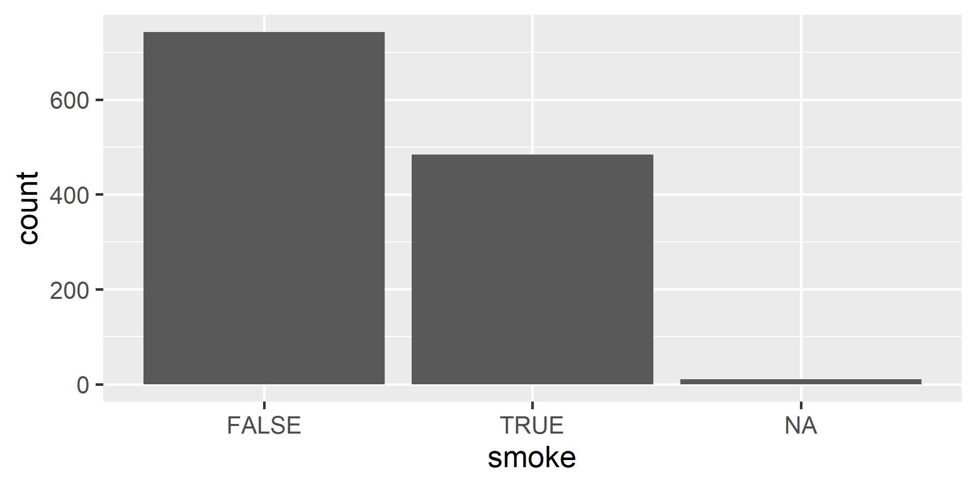
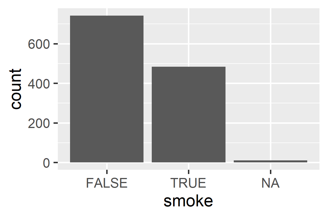
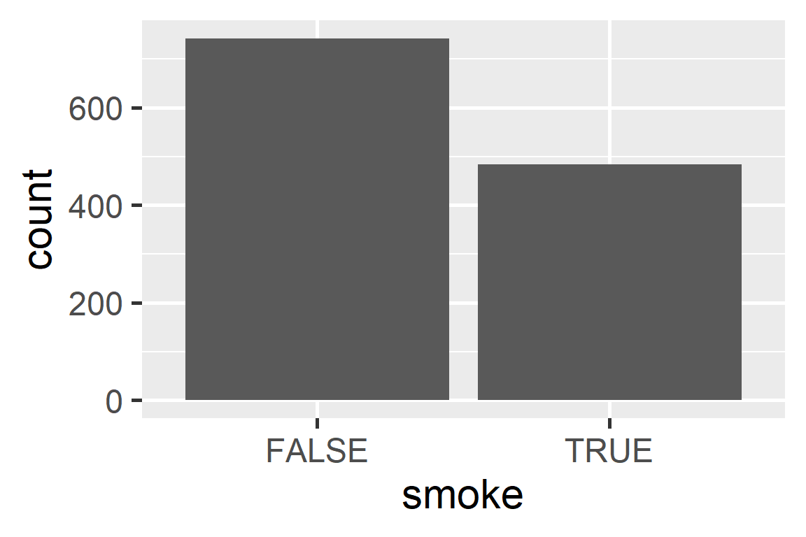
$ smoke <lgl> FALSE, FALSE, TRUE, FALSE, TRUE, FALSE, FALSE, FALSE, FALSE,…Math 430: Lecture 3a
Summary Statistics and Data Visualizations
Bar plot
Bar plot

Bar plot
Bar plot
Bar plot
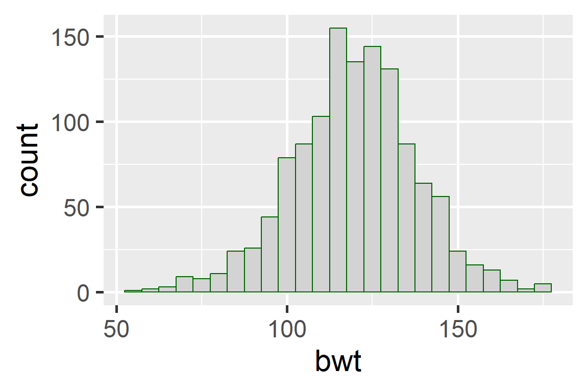
Histogram

Histogram

Histogram
Histogram
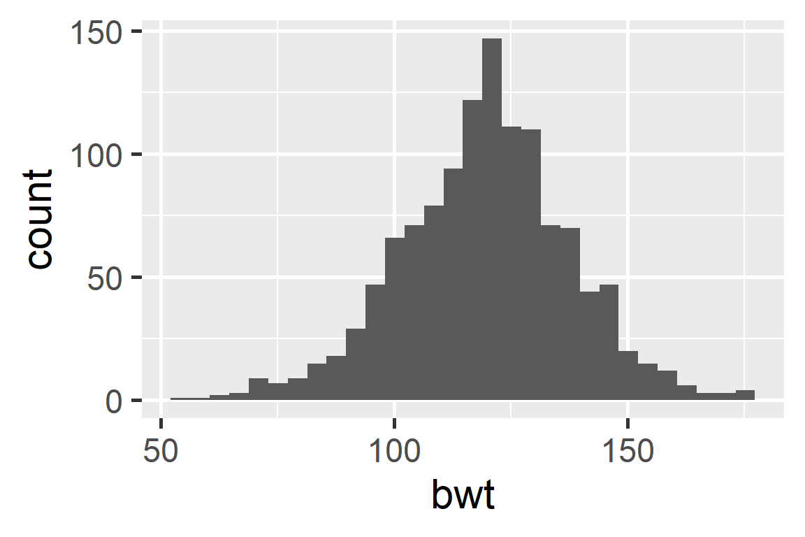
Binwidth
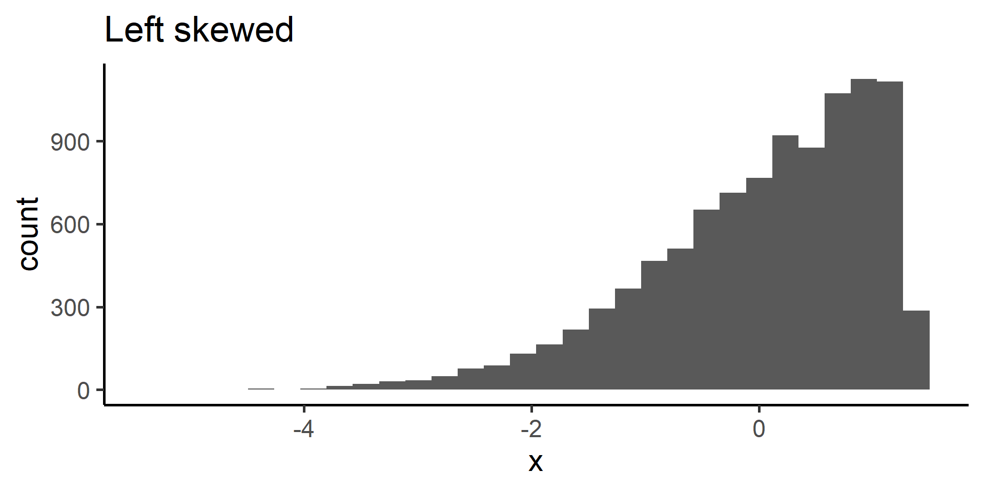
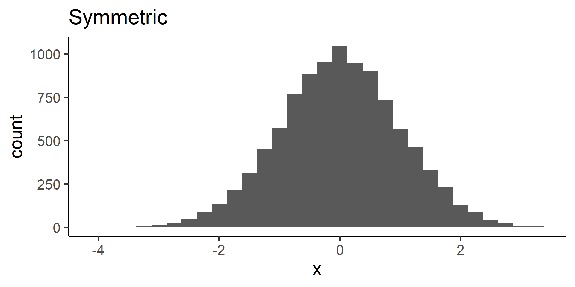
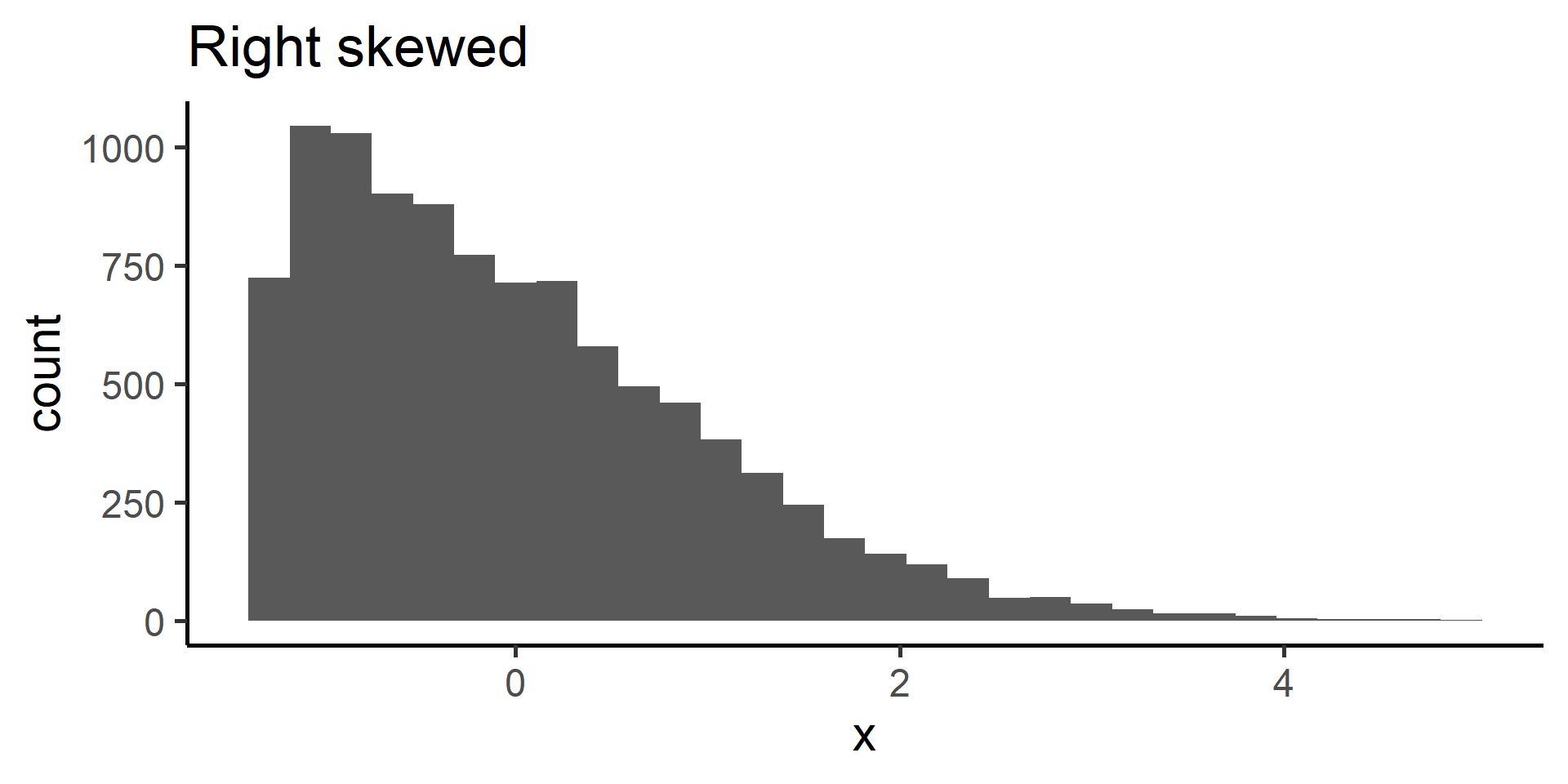
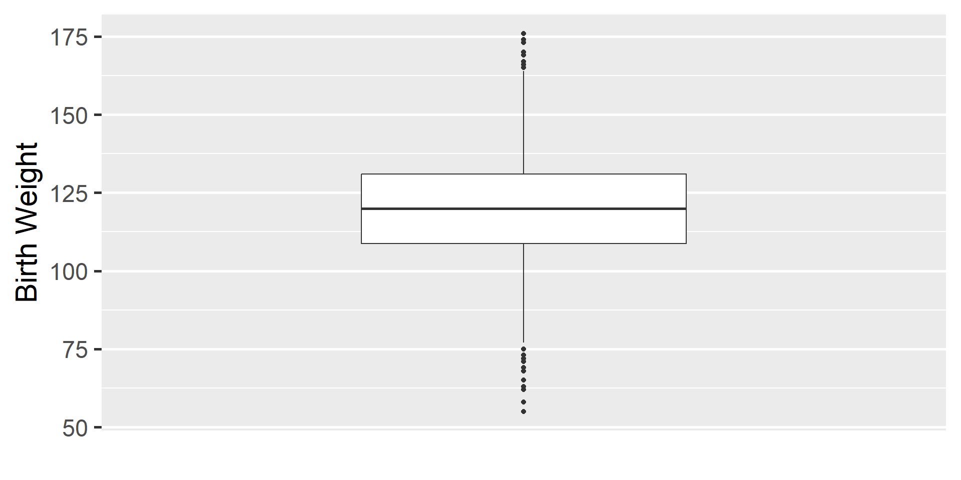
When data display a skewed distribution we rely on median rather than the mean to understand the center of the distribution.
Standardized Bar Plots
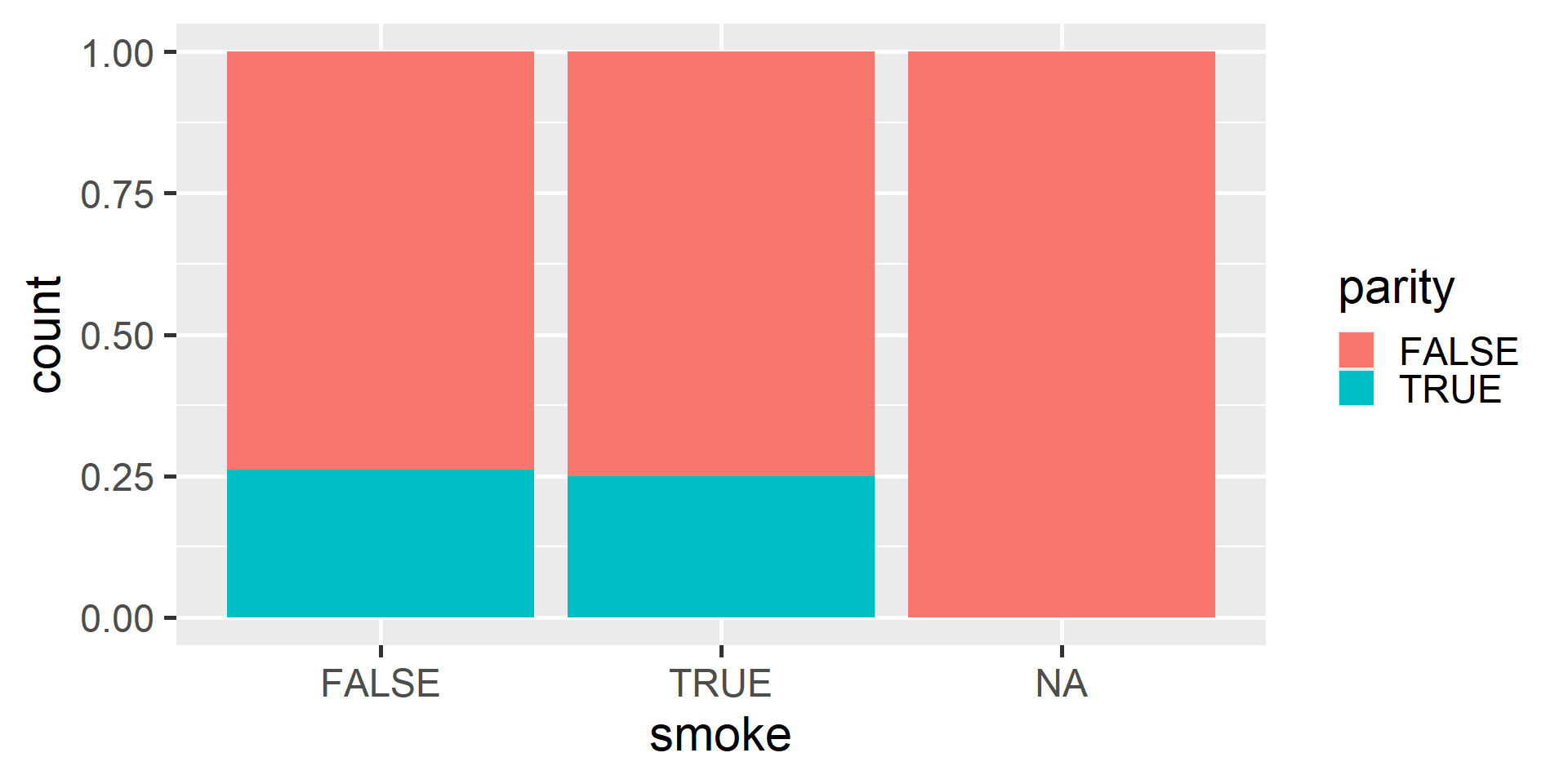
Notice standardized bar plots are actually plotting proportions
Standardized Bar Plots
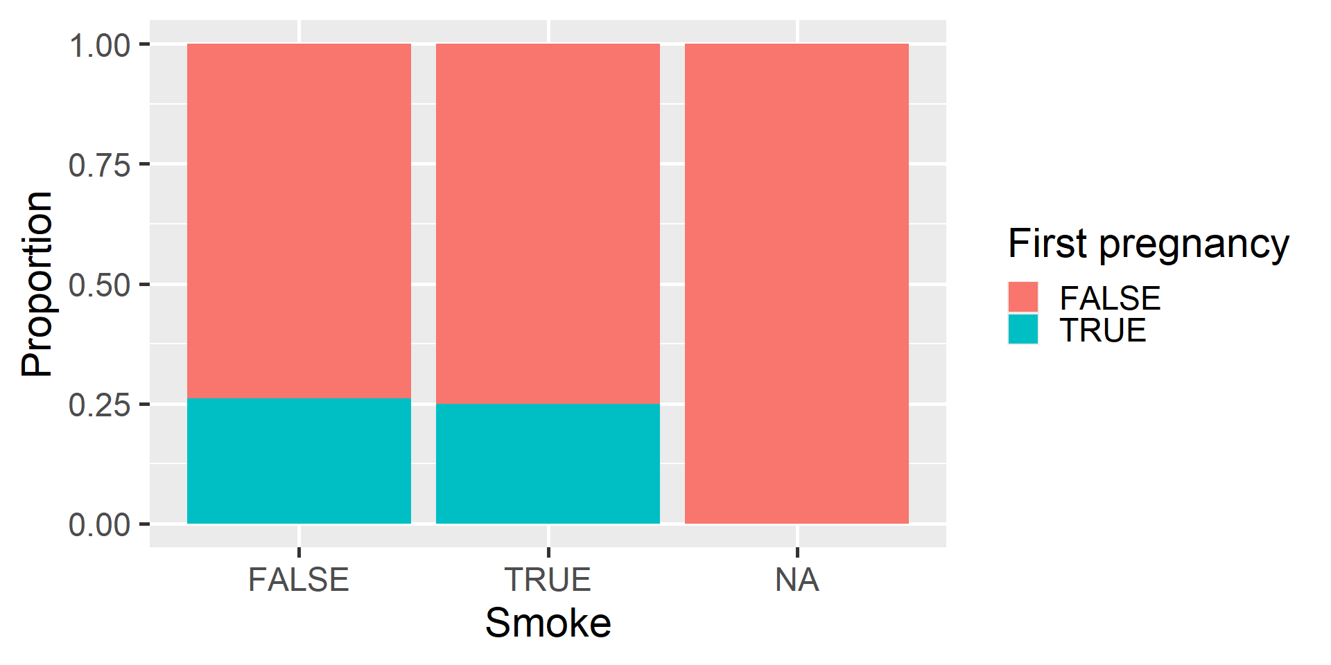
We can use the labs() function to specify labels
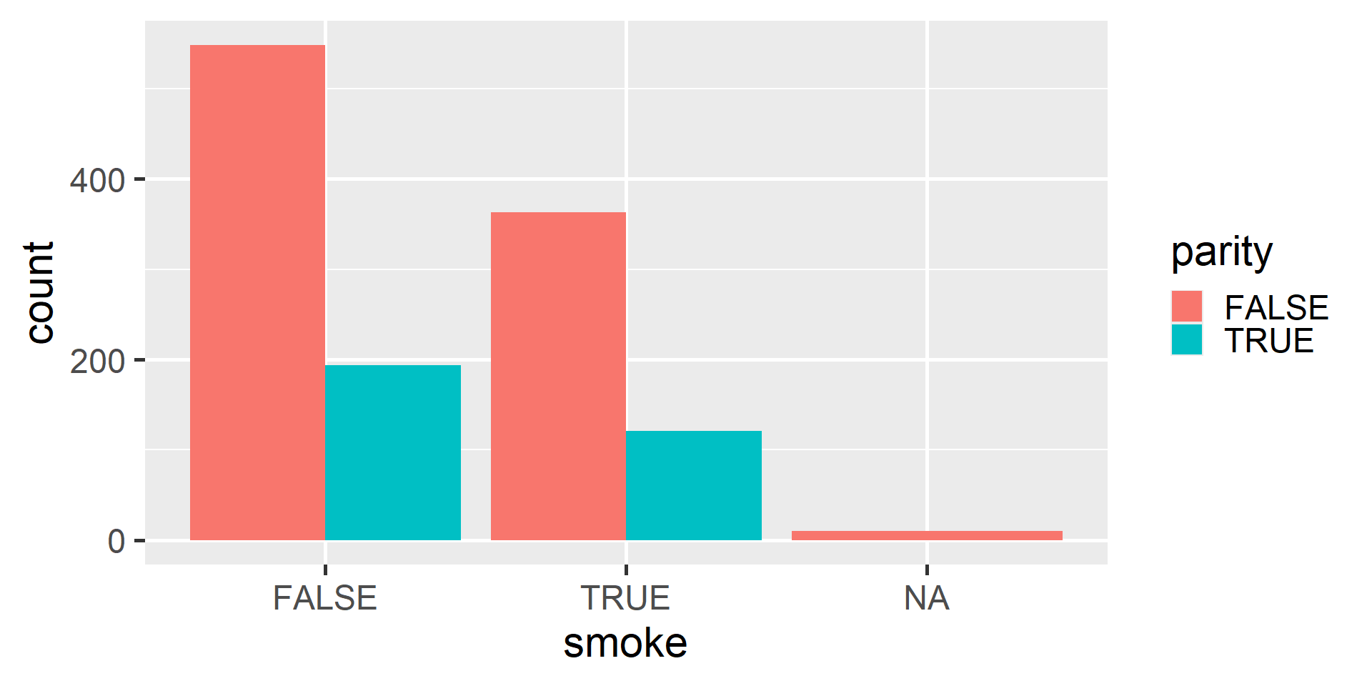
Dodged Bar Plot
Side-by-Side Boxplots
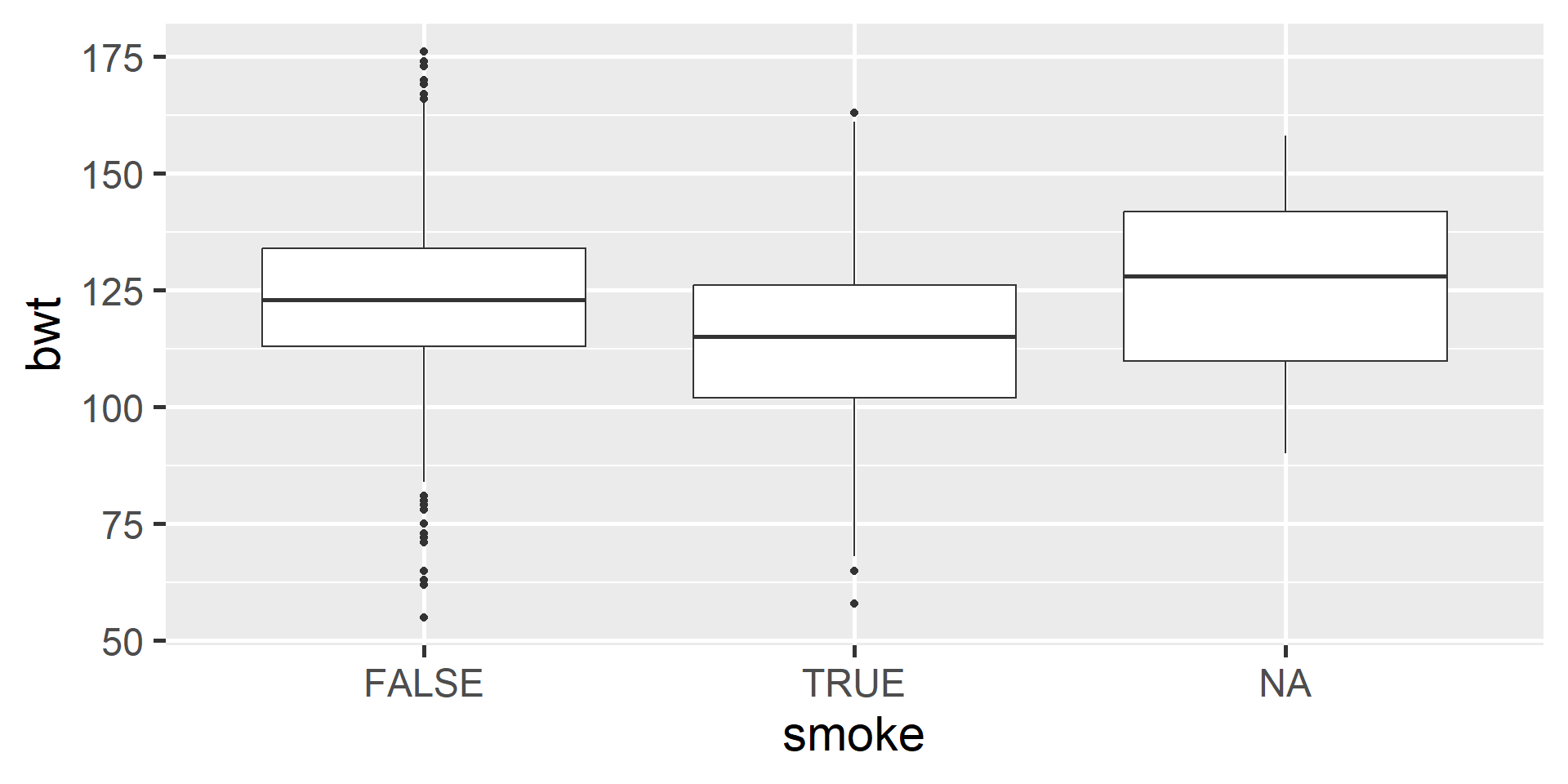
Understanding Each Box
- The horizontal line in the box represents the median.
- The box represents the middle 50% of the data with Q3 on the upper end and Q1 on the lower end.
Understanding Each Box

- Whiskers extend from the box. They can extend up to 1.5 IQR away from the box (i.e. away from Q1 and Q3).
- The points are potential outliers that represent babies with really low or high birth weight.
Scatter plots
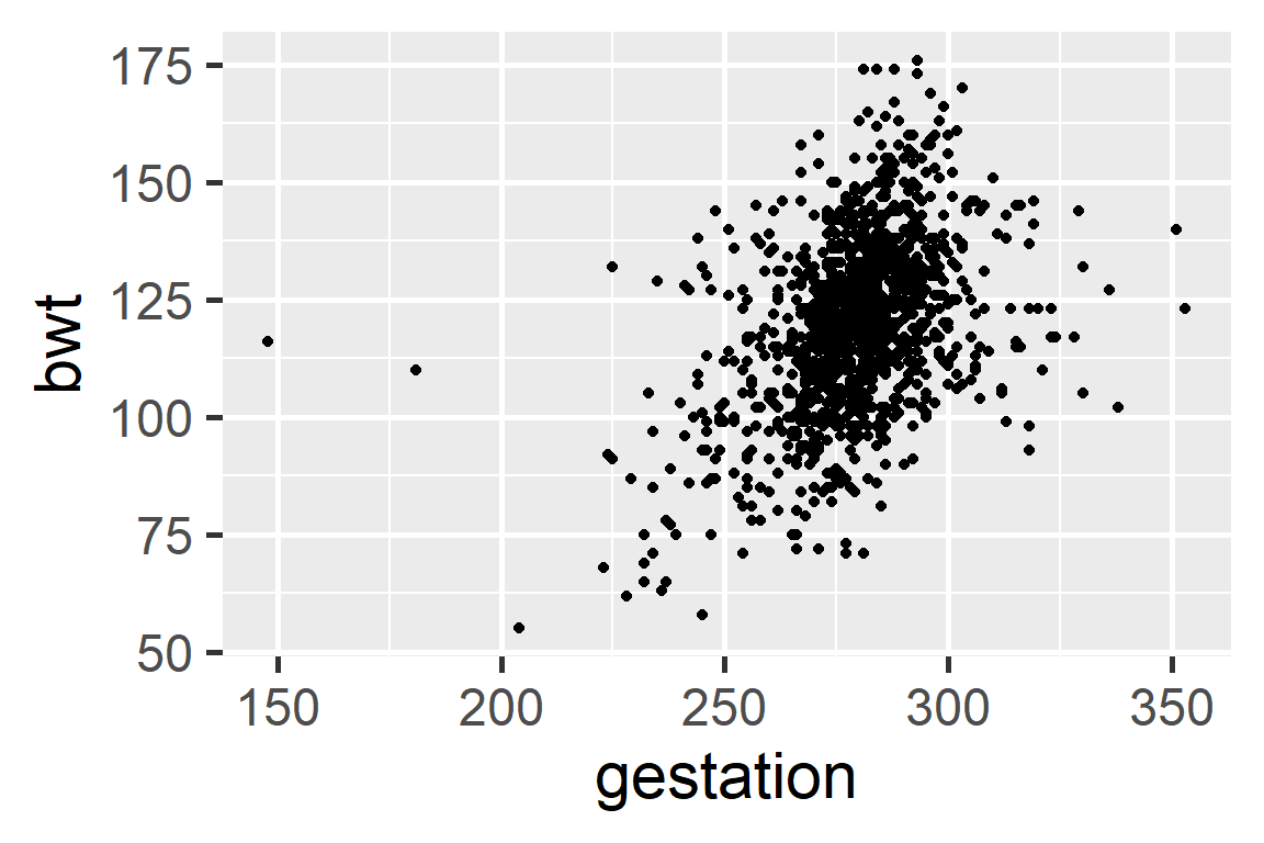
Scatter plots
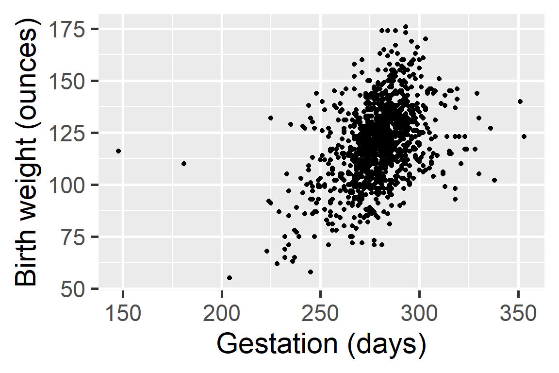
Length of gestation can possibly explain a baby’s birth weight.
Explanatory variable and is shown on the x-axis.
Response variable and is shown on the y-axis.
Linear Relationship
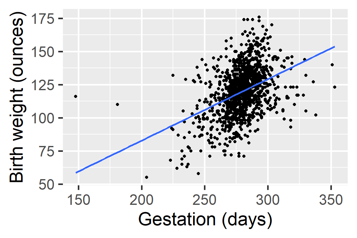
Next we will start statistical modeling during which we will numerically define the relationship between gestation and birth weight. For now we can say that this relationship looks positive and moderate.
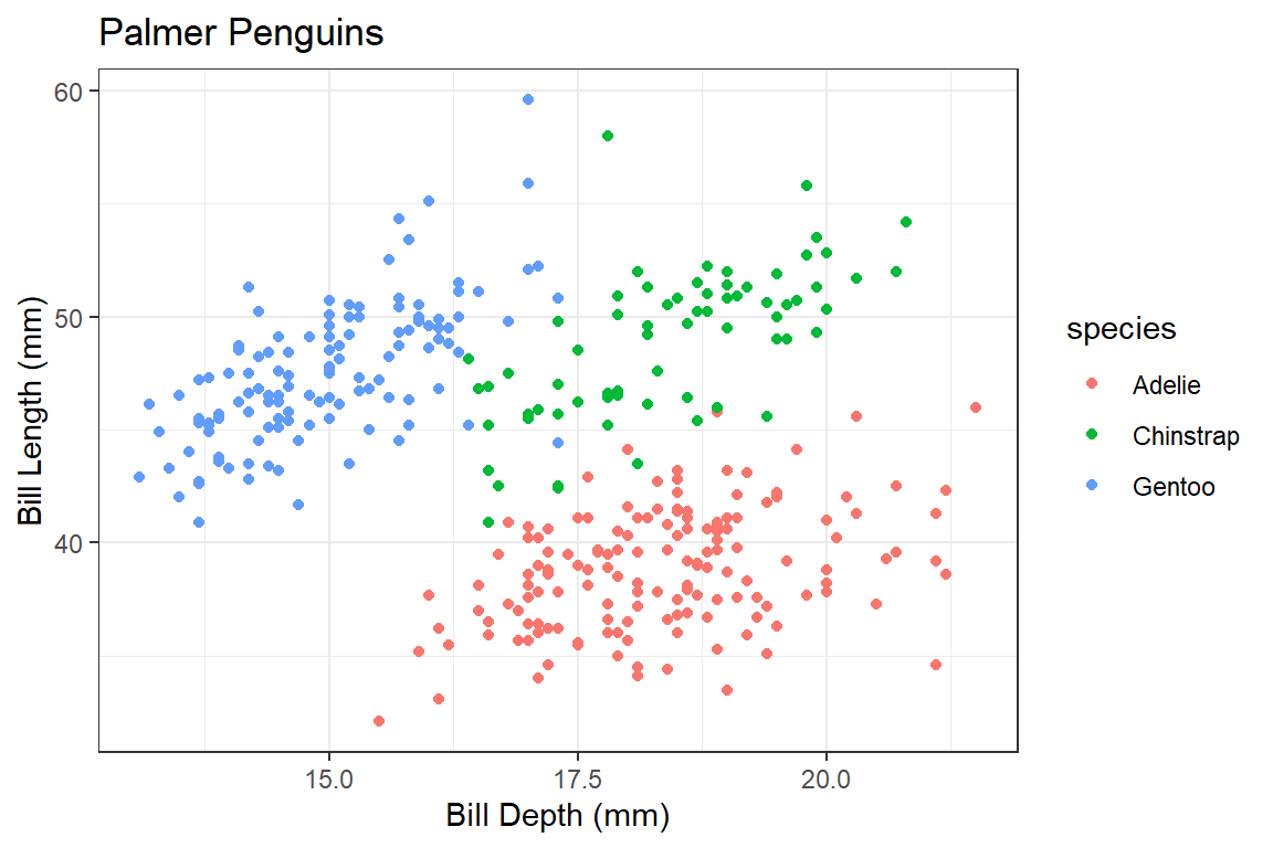
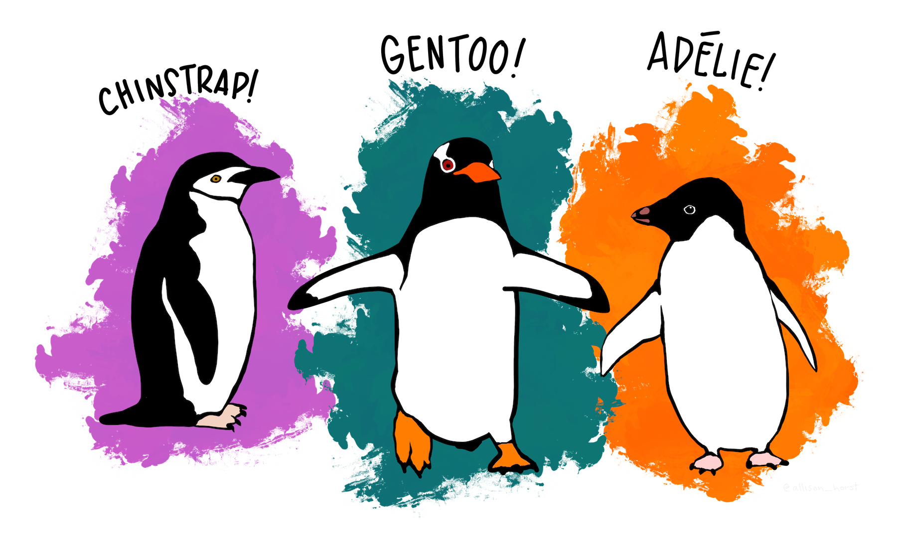
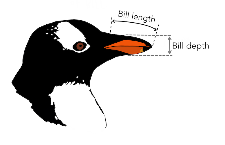
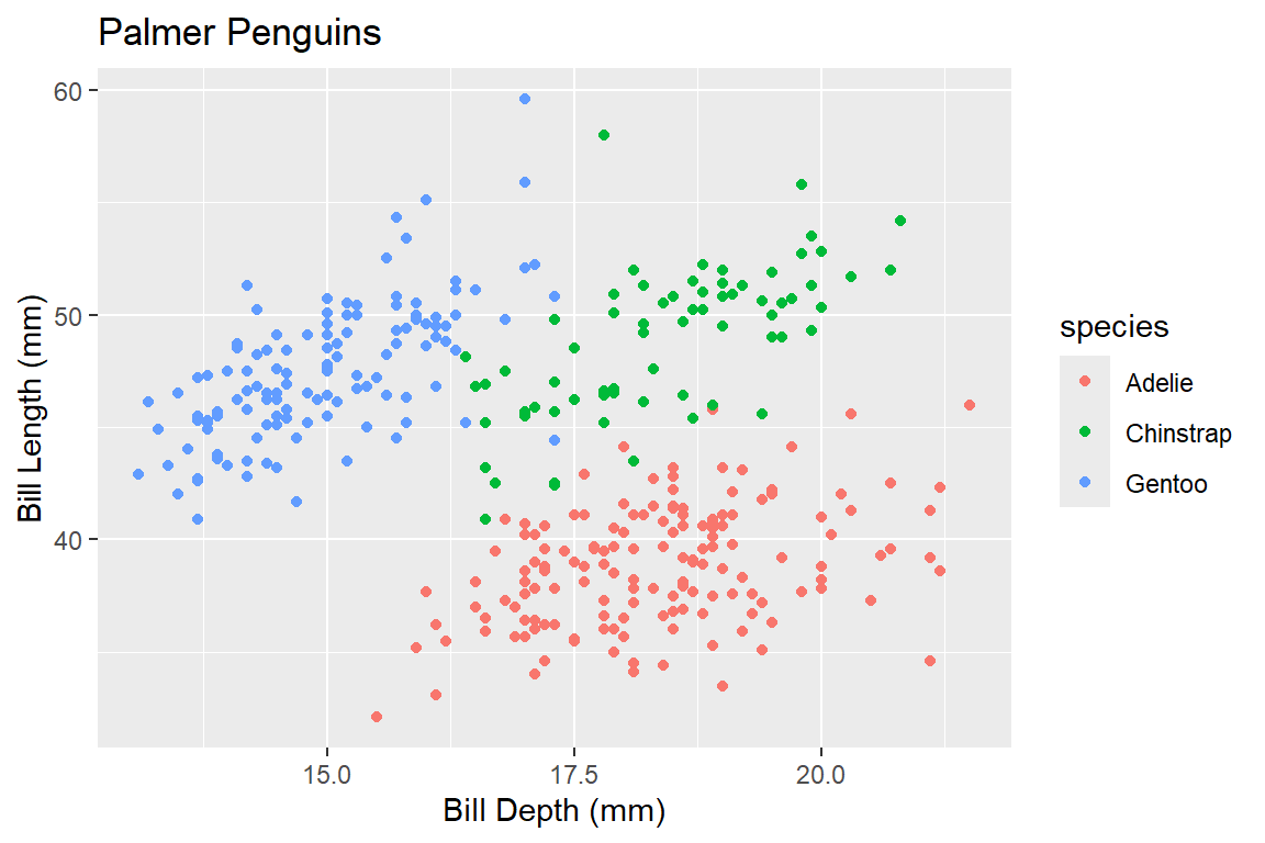
Meet Palmer Penguins1
Visualizing Three Variables
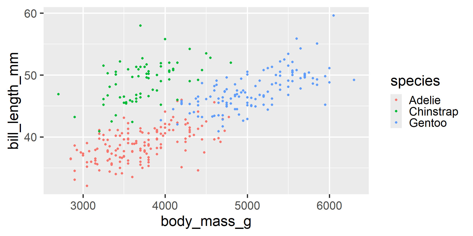
We can use color to consider a third variable
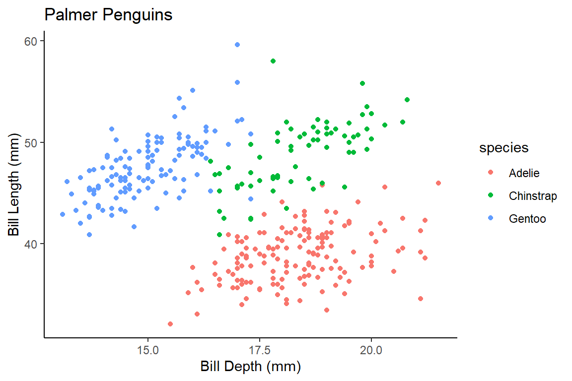
Visualizing Three Variables
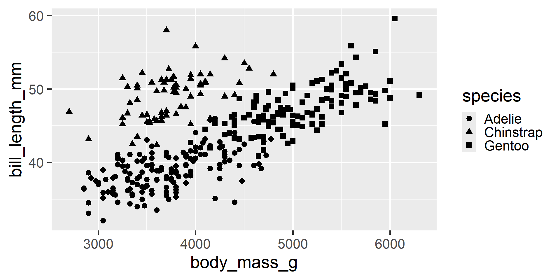
We can even use shapes
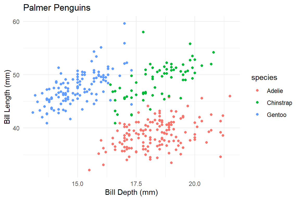
Visualizing Three Variables
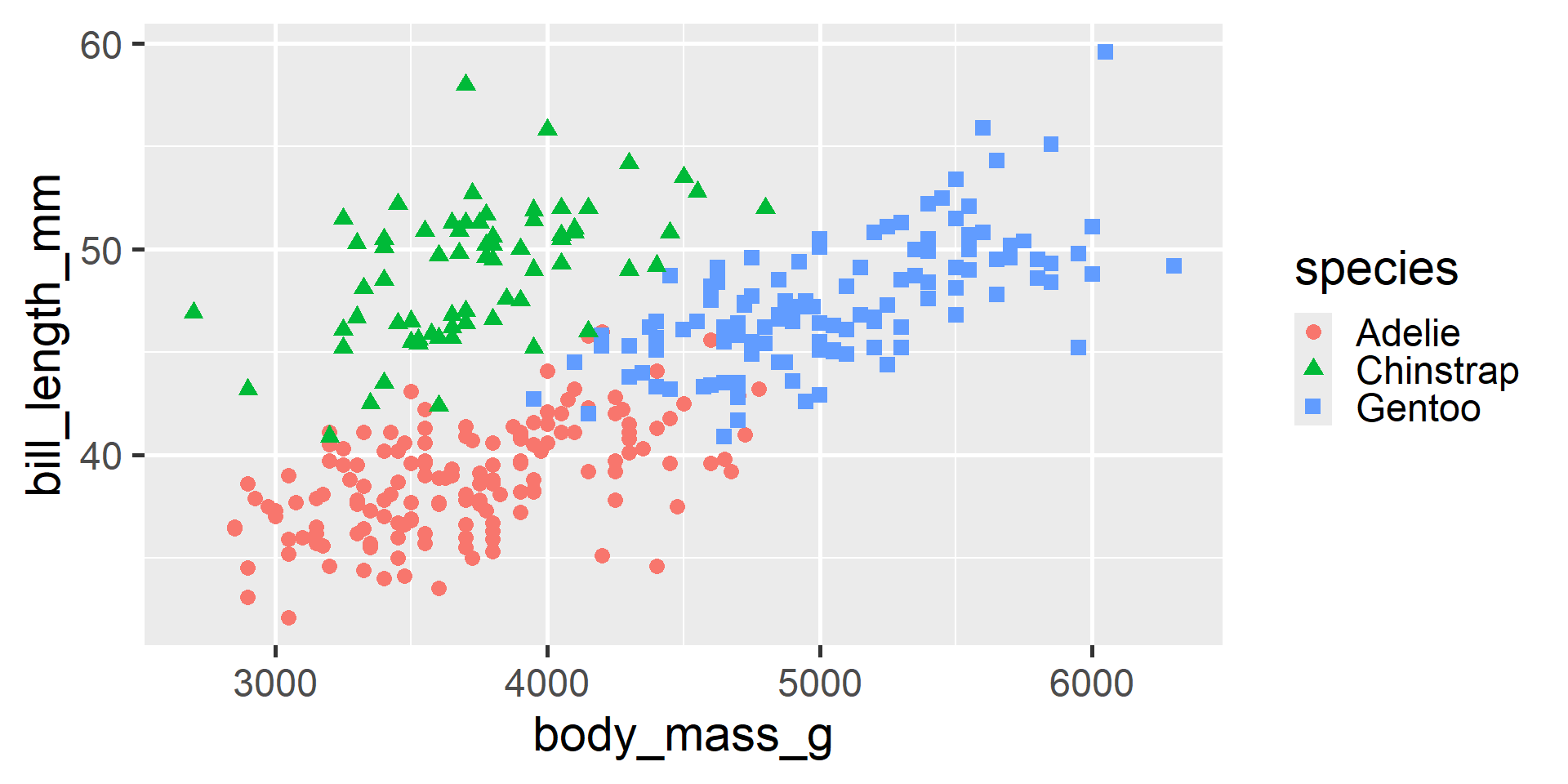
We can even use both!
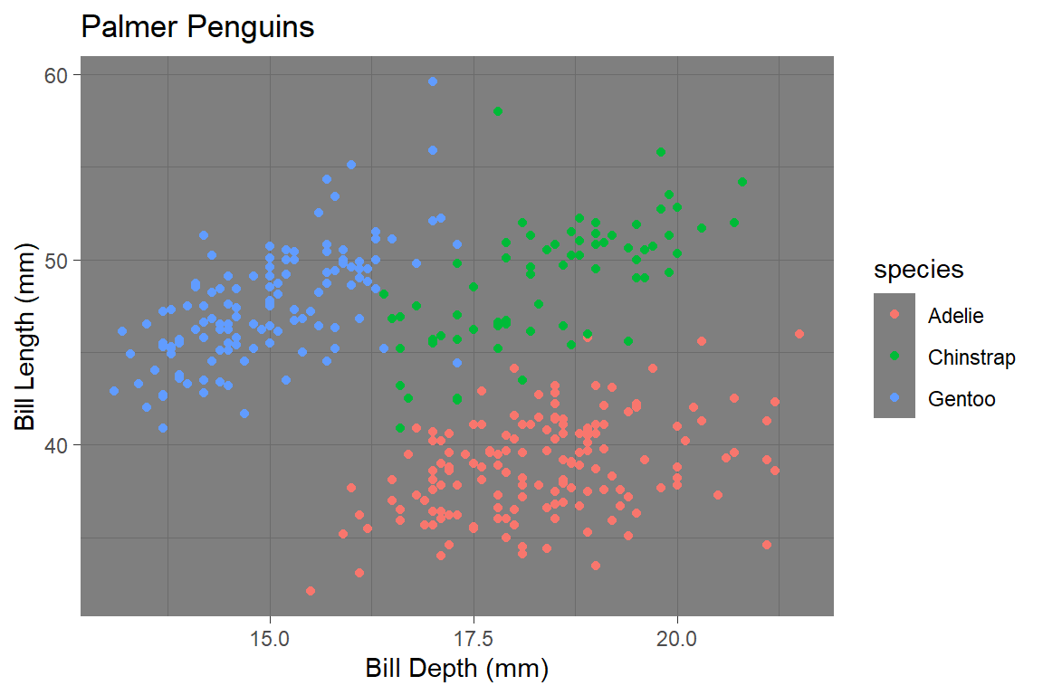
Theme gray is the default theme in ggplot.